Understanding Mobile Responsive Web Design
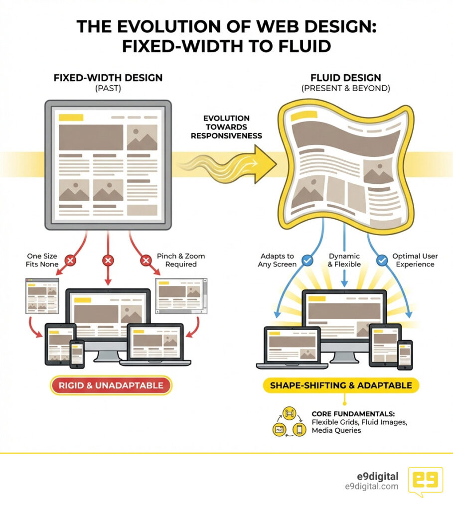
When you hear Mobile responsive web design, it means your website automatically changes its look and layout. It adjusts to fit any screen size, like phones, tablets, or desktops. This ensures a smooth and easy experience for every user.
Here’s what Mobile responsive web design means:
- Adapts to Any Screen: Your website will look great on phones, tablets, laptops, and large monitors.
- Fluid Layouts: Content flows and resizes dynamically, not rigidly.
- Optimal User Experience: No more pinching, zooming, or sideways scrolling on mobile devices.
Have you ever tried to browse a website on your phone but had to pinch, zoom, and scroll just to read the text? That frustrating experience is likely the result of a non-responsive website. People use many different devices to access the internet. A website that looks great on a desktop might be impossible to use on a smartphone if it isn’t responsive.
This is a big problem. An outdated online presence, inconsistent branding, or a website that fails to convert can hurt your business. Mobile responsive web design solves these issues. It makes sure your website provides a consistent and enjoyable experience for everyone, no matter how they visit. This approach makes your site more effective and helps you stand out.
I’m Conrad Strabone, a digital agency founder with over 20 years of experience helping businesses thrive online through effective mobile responsive web design and robust digital strategies. My firm, e9digital, builds websites that become lead-generating assets for our clients.

The Fundamentals of Mobile Responsive Web Design
To understand how a website “shape-shifts,” we have to look back to 2010. That’s when Ethan Marcotte coined by Ethan Marcotte in 2010 the term “responsive web design.” Before this, we were stuck in an “arms race” between web designers and hardware manufacturers. Every time a new screen size came out, designers panicked.
Marcotte proposed a unified approach. Instead of building five different websites for five different devices, we could build one site that used three core technical ingredients:
- Fluid Grids: Layouts built with percentages rather than fixed pixels.
- Flexible Images: Media that scales within its containing element.
- Media Queries: CSS code that asks the browser, “How wide are you?” and applies styles accordingly.
At e9digital, we know that Why Good Website Design Matters goes beyond just looking pretty. It’s about performance and psychology. Research shows that 74% of online users are likely to revisit a website with a mobile-friendly design. If your site doesn’t adapt, you aren’t just losing a click; you’re losing a future customer.
The Crucial Role of the Viewport Meta Tag
Have you ever wondered why old websites look like tiny, ant-sized versions of themselves on a smartphone? That’s because, in the early days of the iPhone, mobile browsers “lied” to websites. They told the site they were 980 pixels wide so they could render the full desktop version, then they zoomed out so it would fit on the small screen.
To fix this, we use the viewport meta tag. It’s a tiny line of code that lives in the of your website:
This tag tells the browser: “Stop lying! Use the actual width of the device and don’t zoom out.” Without this, your media queries won’t even fire correctly. If you want to see if your site is configured properly, you can run Lighthouse audits for viewport configuration to ensure your HTML documents are ready for the modern mobile world.
Relative Units in Mobile Responsive Web Design
In the old days, we used pixels (px) for everything. But pixels are “absolute”—they don’t change. If you set a font to 20px, it stays 20px whether you’re on a 4-inch phone or a 30-inch monitor. In Mobile responsive web design, we prefer relative units.
- % (Percentage): Great for widths. A container that is 50% wide will always take up half the screen.
- em and rem: These are based on font sizes.
remis especially helpful because it’s relative to the “root” (the base font size of the browser). This makes it much easier to maintain accessibility. - vw and vh (Viewport Width/Height): These are fun!
1vwis equal to 1% of the total width of the browser window. - The calc() function: This allows us to mix units. For example,
font-size: calc(1rem + 2vw)creates fluid typography that grows slightly as the screen gets wider but never gets too small to read.
Using these units ensures that your text remains zoomable and readable, which is a key requirement for Website Development.
Core Components and Modern CSS Techniques
Building a shape-shifting website requires modern tools. While we used to use “floats” (which were actually designed for wrapping text around images, not layout), we now have two heavy hitters: Flexbox and CSS Grid.
| Feature | Flexbox | CSS Grid |
|---|---|---|
| Dimension | 1D (Row OR Column) | 2D (Rows AND Columns) |
| Best Use Case | Navigation bars, aligning items in a row | Complex page layouts, magazine-style grids |
| Responsiveness | Content-driven; items wrap naturally | Layout-driven; you define the grid areas |
When we handle Web Design Development for our New York clients, we often combine both. Flexbox handles the “micro” layouts (like a button and an icon), while CSS Grid handles the “macro” layouts (the overall page structure).
Implementing Mobile Responsive Web Design with Flexbox and Grid
The beauty of these tools is how they handle “reflow.” In a responsive layout, content needs to stack vertically on a phone but sit side-by-side on a desktop.

With CSS Grid, we use the fr unit (fractional unit). It represents a fraction of the available space. A layout defined as grid-template-columns: 1fr 1fr 1fr creates three equal columns. By using auto-fit and minmax(), we can tell the browser: “Make these columns at least 300px wide. If there isn’t enough room for three, just stack them!” This creates a layout that responds automatically without us having to write hundreds of lines of code.
Responsive Media and Typography
It’s not just the layout that needs to move; the content does too.
- Images: We use
max-width: 100%; height: auto;. This ensures an image never gets wider than its container but keeps its proportions so it doesn’t look like a funhouse mirror. - The Picture Element: Sometimes, scaling isn’t enough. You might want a horizontal photo for desktop but a vertical “cropped” version for mobile. The
element andsrcsetattribute allow the browser to pick the best image file based on the user’s screen size and resolution. - Typography: We use the
clamp()function. It takes three values: a minimum, a preferred, and a maximum size. For example,font-size: clamp(1rem, 5vw, 3rem)ensures your headline is never tiny on a phone but doesn’t become monstrous on a desktop.
We also follow line length guidelines. Reading a line of text that spans the entire width of a widescreen monitor is exhausting. We aim for 50–75 characters per line for the best reading experience. And don’t forget the “fat finger” rule: touch targets (like buttons) should be at least 44×44 pixels so users can actually click them!
Why a Mobile-First Approach Wins
“Mobile-first” is a design philosophy where we start by designing for the smallest screen and then add complexity as the screen gets larger. This is called progressive enhancement.
Why do we do this?
- Content Prioritization: On a small screen, you don’t have room for fluff. It forces you to decide what is truly important for your user.
- Performance: Mobile devices often have slower connections. Starting small helps keep the site fast.
- SEO: This is the big one. Google’s mobile-first indexing and ranking priority means that Google primarily looks at the mobile version of your site to decide where you rank. If your mobile site is an afterthought, your search rankings will reflect that.
Keeping up with Website Trends means recognizing that mobile is no longer a secondary “add-on”—it is the primary way the world views the web.
Responsive vs. Adaptive Design
You might hear the term “Adaptive Design” and wonder if it’s the same thing. It isn’t.
- Responsive Design: Think of it like a liquid. You pour it into any container (screen), and it flows to fill the shape perfectly. It uses one fluid layout.
- Adaptive Design: Think of it like a set of snapshots. The website detects the device and loads a specific, fixed layout for that size (e.g., one for iPhone 13, one for iPad, one for Desktop).
At e9digital, we almost always recommend Mobile responsive web design. It is much more efficient to maintain one fluid site than six different fixed ones. Plus, it’s better for SEO because you don’t have to worry about duplicate content on different subdomains (like m.yourwebsite.com).
Testing and Streamlining Your Workflow
How do we ensure the “shape-shifter” is working correctly? We don’t just buy every phone on the market. We use tools like Chrome DevTools Device Mode.
By right-clicking on a page and selecting “Inspect,” we can toggle a device toolbar that lets us see exactly how the site looks on an iPhone, a Pixel, or a tablet. We can even simulate slow 3G speeds to see how the site loads.
In our design phase, we use Figma. Its “auto-layout” and constraints features allow our designers to create prototypes that behave like real responsive websites. This streamlines the handoff to our developers, ensuring that the Hiring A Web Design Agency experience is seamless for our clients.
Frequently Asked Questions about Responsive Design
How does responsive design affect SEO?
Responsive design is Google’s recommended configuration. It improves SEO by providing a consistent user experience, reducing bounce rates (people leaving because the site is hard to use), and preventing “duplicate content” issues. Since Google uses mobile-first indexing, a responsive site is essential for ranking well in search results.
What is the difference between responsive and mobile-first design?
Responsive design is the technical method (using fluid grids and media queries). Mobile-first is the design strategy (starting with the smallest screen and working up). You use responsive design techniques to build a mobile-first website.
How can I test if my website is truly responsive?
The easiest way is to open your site on a desktop and manually shrink the browser window. Does the content “flow” and stack nicely, or does a horizontal scrollbar appear? You can also use the Chrome DevTools “Device Mode” or Google’s Search Console to check for mobile usability errors.
Conclusion
In the competitive landscape of New York City, your digital presence cannot afford to be rigid. Whether you are a boutique law firm in Manhattan or a tech startup in Brooklyn, your website must be a shape-shifter, ready to greet your customers with a perfect experience on whatever device they happen to pull out of their pocket.
At e9digital, we combine Custom Web Design New York with strategic technical expertise to build websites that don’t just look good—they drive business. We focus on the “why” behind the design, ensuring your site connects with users and converts them into loyal clients.
Ready to turn your website into a high-performing shape-shifter? Let’s build something disruptive together.
The post Why Your Website Needs to Be a Shape-Shifter appeared first on e9digital.